Friday, 26 April 2013

How effective is the combination of my main product and ancillary texts?

It is important in terms of advertising the product that all of the different media products use and repeat the same conventions within this genre. Using the same conventions means that this remains a level of consistency and the audience will be able to recognize that all the products belong to the same brand. This was an important element to be considered throughout the process of construction of the ancillary texts and movie trailer. Below shows the different ways in which the level of consistency and how this is effective the font style is for the target audience.


The fonts above show the font used within the movie trailer and the font below is what has been used on the movie poster. The font 'Scorched Earth' has been used within both of these media products and show a high level of consistency. The font style is effective as it looks as the effects at the bottom of each letter looks like the zombie like creature has been scratching at the font to get in and eat the brains of the audience. This is also effective as it meets the conventions of the font style of the real media products within this genre. 


The way in which the red effects have been placed inside the font also adds an element of this could represent blood shot eyes of the characters showing that they get no sleep as they are constantly aware of the zombie like creatures. The way in which the film poster shows only the bottom half of the face. This has been put in to place from the research that was completed from the real media movie poster 'The Crazies'. Using this type of character shot adds a sense of mystery of who is acting within it. This proved to be very popular with the target audience as this gained very positive feedback. 

Within the Front cover, I have not used this font style as this a different media product that has its own house style of which needs to be work to. The front cover is effective as the bold fonts help advertise and draw the audience into the product with the use of bold fonts and bright red font colour. This red is effective as this colour represents danger, blood and death which fit's the genre perfectly.


The character used within the poster, magazine front cover and the movie trailer is consistent as the character is the same, he has the same costume and the effect is the same. The use of the same character, the use of the same effects and Mise-en-scene contributes a sense of familiarity within the three media products which allows easy identification which is very important in terms of audience. The images below show how all three have included these aspects to produce an effective main product and ancillary texts.


Lastly the tag-line of the film 'The struggle begins' is on all of the products which is effective as this provides more level of consistency and provides the audience with a clear memorable phrase of which sums up the film and allows it to reinforce the audiences memory of the product. 
This image below shows how this has been done:


Monday, 22 April 2013

What have I learnt from my audience feedback?

The development process was essential as a lot of audience feedback was collected and was taken into consideration when making alterations to the teaser trailer and the two ancillary tasks. The feedback such as
It’s not that bad, but the colour blue doesn't really represent the genre of the film"
“The face on the girl is very dark and therefore cannot see her” were very helpful when it came to making improvements to the Ancillary products.
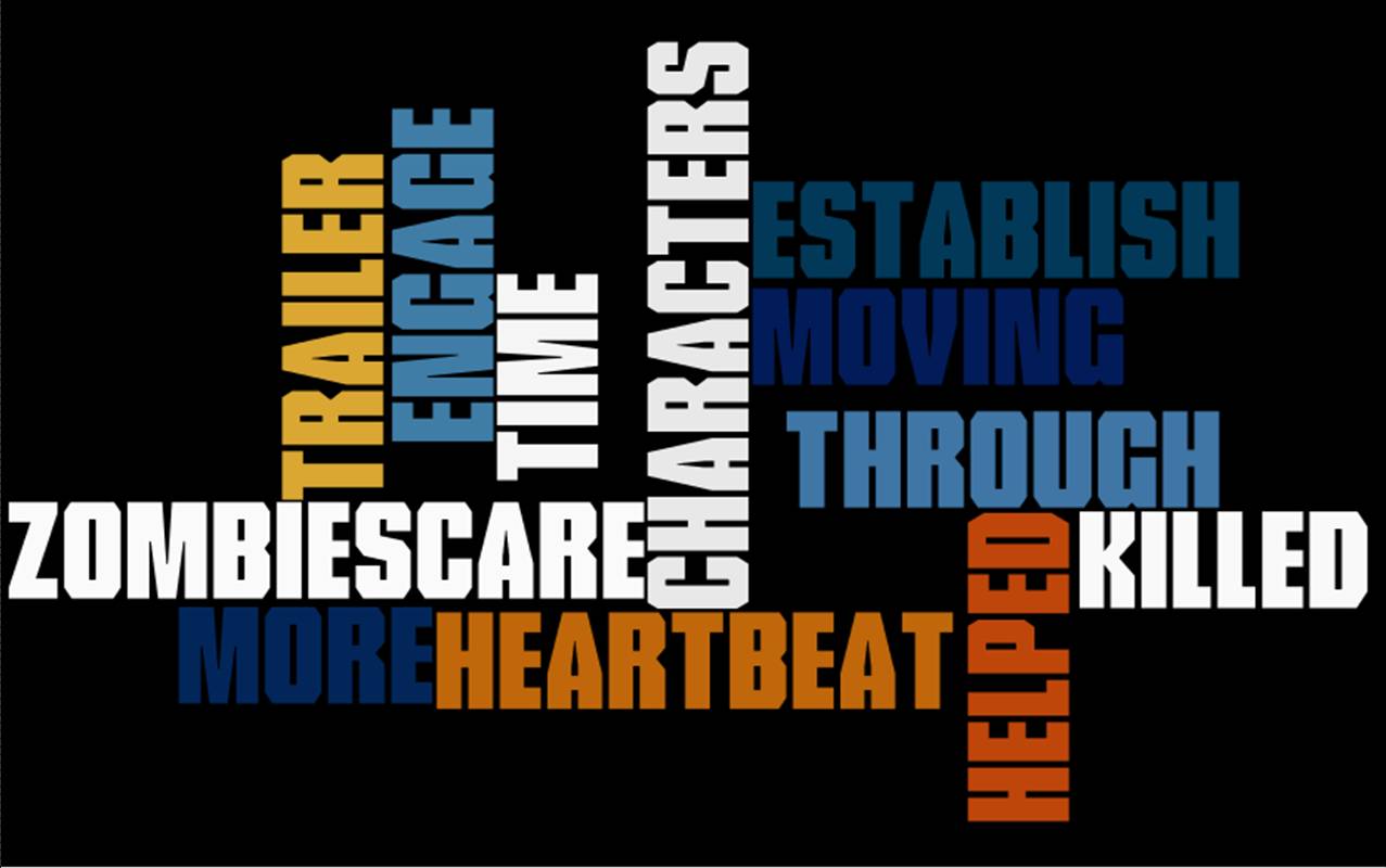
On the 25th May, a creative arts evening was held in the school hall, which allowed the targeted audience to come and watch the film trailer. This was a good opportunity to gain feedback off of the targeted audience in terms of the print media that has been created. The movie magazine front cover and movie poster received a majority of positive feedback. This has been quoted and the key aspects have been placed onto a Wordle document:
"The movie poster is mysterious as we dont know what actor is in it, adding that sense of not letting much of the story away"
"The movie poster helps provide a sense of the genre. The dark background, the spade in his hand shows that it is a dark horror film, with action incorporated within."
"The front cover looks really professional and looks like a real media product"
"The front cover of 'The Film Magazine' provides me with as much detail I need to make me want to read more about it and makes me want to turn the page"
"They are both very effective and match the conventions of existing products. The genre is also clearly provided in terms of images and font styles. Very good, I like them both"


This was also a good opportunity to get their reactions to certain aspects of the trailer. At the end of the evening, the targeted audience then provided some very crucial feedback of which was then used to make improvements and adjustments to the trailer. Here is what some of the audience had to say about Apocalypse: Teaser Trailer.
The audience targeted: 

"The music helped engage me with the trailer"
"The different types of shots helped show that it was moving through time"
"The trailer should have been longer as I wanted to see more"
"The heartbeat worked well as it lead up to the zombie scare at the end"
"It helped me establish everything that was going on, like the characters and what they are doing to not get killed"


This audience feedback was successful as the trailer managed to meet the codes and conventions of real media products and allows the audience to be pleased as this also matches the genre. The target audience  was particularly important as the trailer aimed at this particular age group and people who find horror/action as their favorite genres. If Apocalypse didn't please the targeted audience, it then becomes a failure. 

The audience not targeted:
"The zombie at the end made me jump out of my seat, that was scary!"
"I wanted to see more"
"It looks quite scary and horrific by the last shot I saw"
"Didn't give much away which is good as I want to know what happens to the characters"
"I dont like horror films so this didn't really appeal to me but I think that the way in which certain shots have been put together are quite effective"


The audience that the trailer was not aimed at provided the movie trailer with some positive feedback. It is clear that particular shots have been used for certain effects and this has been achieved as the audience that the trailer was not aimed at, picked up on these and wanted to watch more, find out more about the film and the films background. This is a positive outlook on this aspect as the trailer has not only reached out to the target audience, but has drawn in more of an audience.

The reaction of the trailer was also captured on film at the creative arts evening and here is that reaction:


The reaction was very positive as there were huge claps towards the end which was then stopped by the scare of the zombie used at the end of which made them jump. This was the objective of that shot and it was successful.

Thursday, 18 April 2013

In what ways does my media product use, develop or challenge forms and conventions of real media products?

The video clip below provides a clear descriptive explanation of how the media product has used, developed or challenged forms and conventions of real media products. Collecting research from the real media products and collecting clear ideas of the codes and conventions helped allow these to be used, developed and to challenge them in order to make 'Apocalypse' stand out. The video is in slow motion so that the description is clearer to hear and understand how this media product uses, develops and challenges the forms and conventions of real media products.

http://www.youtube.com/watch?v=zZ9gjMOOO5o&feature=youtu.be&safe=active
The video clip below provides a clear descriptive explanation of the movie poster has used and developed forms and conventions of real media products. Collecting the appropriate research for the movie poster allowed certain aspects to be used and developed in order to make the poster advertise Apocalypse in an effective way.

http://www.youtube.com/watch?v=JXHwA0H6RKE&safe=active

The video clip below provides a clear descriptive explanation of the magazine front cover has used and developed forms and conventions of real media products. Collecting the appropriate research for the magazine front cover allowed certain aspects to be used and developed in order to make the front cover advertise Apocalypse in an effective and different way to the other ancillary product.

http://www.youtube.com/watch?v=_iPu8YCwVUM&safe=active

Tuesday, 16 April 2013

The movie trailer in the making, part 2...

These are some clips of which I have captured which show how I have edited some footage and adding in some music to the video. I have edited a certain clip of which is an extreme close-up of Jonah trying to access a television programme of which he can access to find out if anyone else has survived or any more news broadcasts have been published, if any.

This is the clip:

I am also going to provide you with a clip of which I have added a soundtrack 'Action District' to the stage. This is the soundtrack that we are going to use and will provide evidence of how this was placed on to Adobe Premier Pro.

This is the clip:

I am also going to provide evidence of me editing the trailer in the form of images. The images of which are going to be displayed are of me matching up the certain shots with the storyboard to enable a level of consistency among our planning and development.


Friday, 12 April 2013

The Movie trailer in the making...

As a group we have started to put together a movie trailer. From the shots we have filmed, we have started to edit them in Adobe Premier Pro and collating them together. We stuck to our storyboards which has helped guide us put certain types of shots together to keep up the fast tempo of which we intended on using. I have been editing certain shots and cutting them down so we can collect and link different types of shots, and then adding the effects on. This will help build tension for the audience and emotional appeal to them in terms of the three trying to survive in this deathly apocalyptic universe.

Here is a rough cut of editing so far in terms of action shots, location shots and character shots:


Monday, 8 April 2013

Filming

Over a prolong period of time from 04/03/13 to 08/04/13, my group and I have been filming various shots that we wish to include within the trailer, these include:
·         Filming in technicians room
·         Location shots (Lake, bridge, and moving locations)
·         Bluewater Park Shots
·         Thamesmead character shots
·         Thamesmead running shots
·         Safe house shots (looking at maps, dialogue between characters)
·         Video Diary
·         Running through woods
·         Outside characters house (in house as well)
·         Zombie scare at the end
·         Action shots (include hitting unseen zombies, running through woods etc.)
All of these shots will be included within the creation of the movie trailer. This was a long process of which caused a lot of stress. However we managed to capture the right shots of which we need including. I however didn’t manage to film that much as I was the main character being filmed, however I did manage to film shots of which I wasn’t in. For example, zombie scare, the missing posters, and some of the location shots.